Royal Opera House
- excellence without arrogance
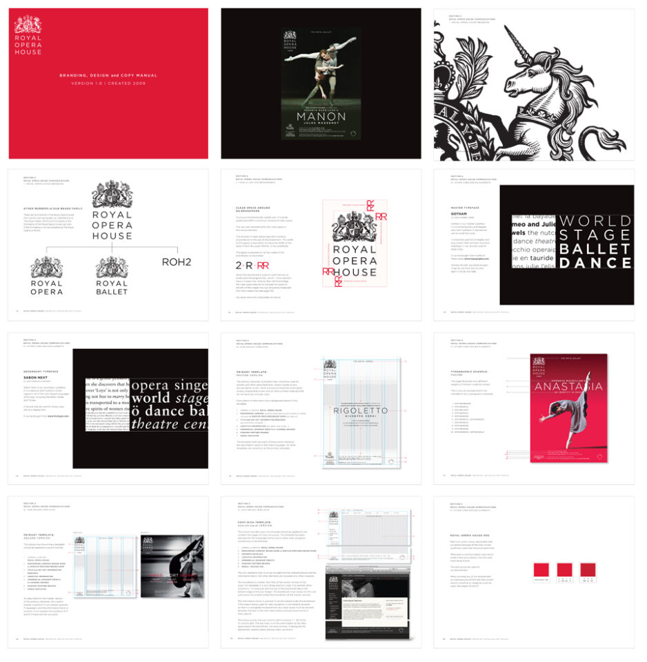
The rebranding of the Royal Opera House (ROH) in Covent Garden started in the beginning of 2008 and was a collaboration between The Agency of SomeOne, where Therese Severinsen was lead designer, Martin Lambie-Nairn and one of the UK’s finest engravers Christofer Wormell. The brief was to strategically find a name for the opera house, create a hierarchy for the different departments and update the visual identity. All this needed to support the world class program the ROH offered whilst bring the house into the 21st century.
A bespoke coherent design system with firm rules was also build which were applied across the multiple messages given to ROH audiences. The identity are today used exactly as it was designed then, still applied in a modern and up to date way by the designers.
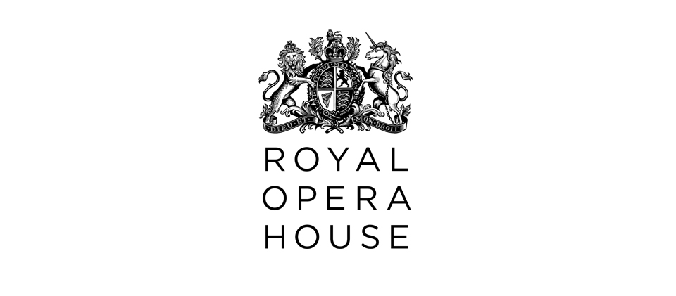
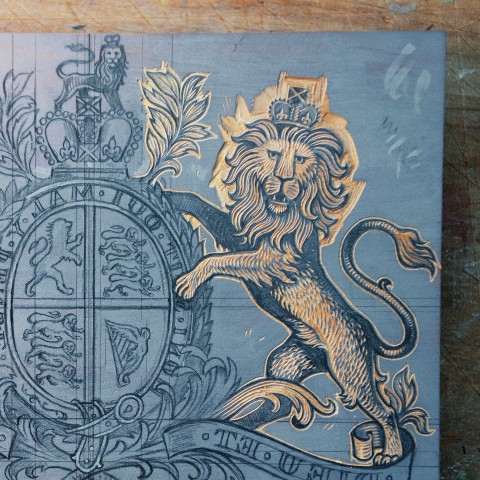
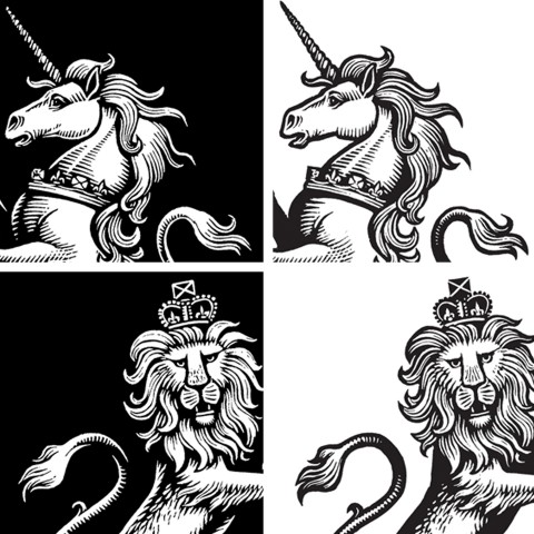
The challenge with the old coat of arms was that it was not digitally adept, it struggled to be clear at smaller sizes and wasn’t elegant when employed on large scale applications.
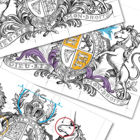
The new crest needed to carried the same history and heritage as the old one and to create a new story we commissioned one of the UK’s finest engravers Christofer Wormell who was using the same wood engraving method that was used to design the old coat of arms.
Except from the story, the intention was to make the Royal Coat of Arms work in all media and designed to be equally elegant on both small and large applications. Not to make it ‘modern for moderns sake’ but elegant, traditional yet designed for C21st communications. We also added a new typographic approach that updated the feel of the communications with a simple and clear sans serif to counter the classic look of the crest.
Project Brand identity
Client The Royal Opera House in London
Industry Culture
Project was made while working at The Agency Of SomeOne together with Martin Lambie-Nairn.
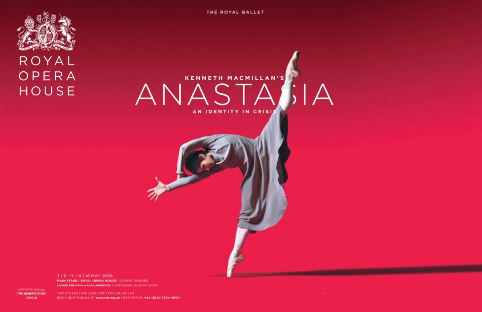
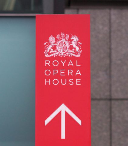
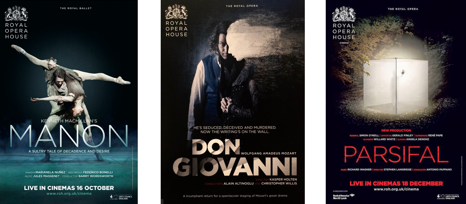
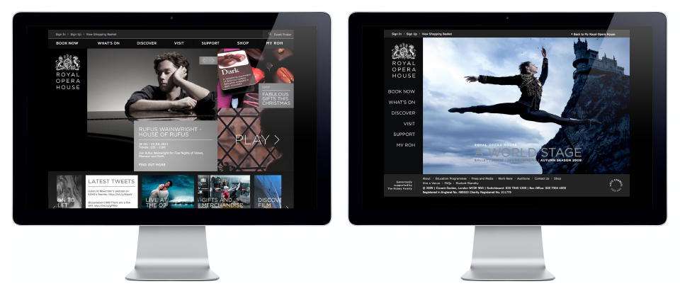
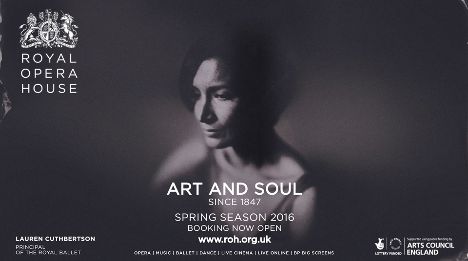
The posters, website and billboard shown above are design by ROH using the design principles we created.