Newport School
the role of design in education
Newport School in Leyton London, was identified as failing, not meeting the governments expectations for learning. As part of the journey to reach their new goal a rebrand was developed to communicate the change that was about to happened.
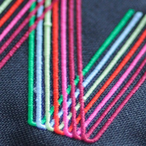
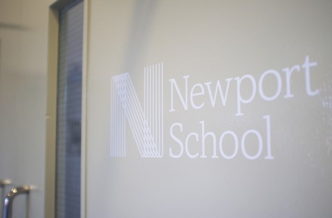
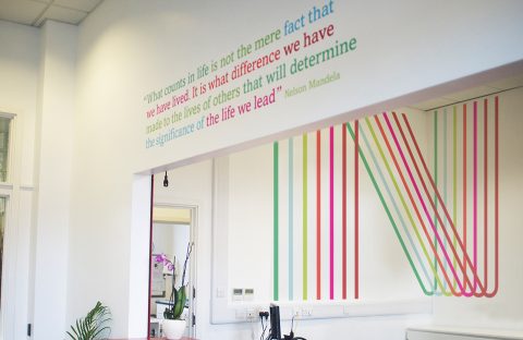
An emblem shaped as the capital letter N was designed to represent each students individual learning path and the many colours were showing the diversity in the school. The identity was applied to uniforms, stationery, educational material, website and signage around the school and a big N, which can be seen on Google Earth was drawn on the playground. Prue took the school to an amazing level and today is Newport classed as an Outstanding School by Ofsted – the Office for Standards in Education, in the UK.


“It’s a natural impulse to nurture our young
– let that impulse extend to the places where young people learn”
– Bruce Mau, BMD.
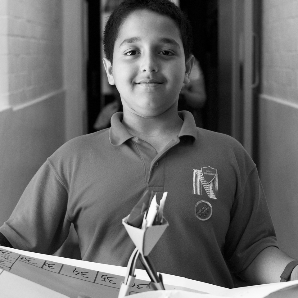
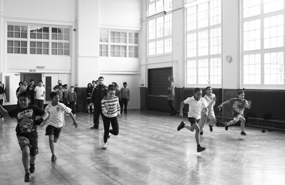
Prue Barnes, head teacher at Newport School, value what design & art can do to students learning experience and well being. I share her view and was therefore very delighted to also be commissioned to help on the re-design of the interior for the reception, corridors and 3 offices in the school. As part of the project, I also spend two days documenting and photography the students in their school, and the pictures are now displayed in the main corridor at Newport.
Klick here to see some of the photographs taken at Newport School.

Project Brand identity, photography, rollout & interior.
Industry Primary/Secondary Education
Client Executive Headteacher Prue Barnes at Newport School in East London
Creative Direction, Design & Photography Therese Severinsen – Studio Mnemonic