Eurostar
always moving forward
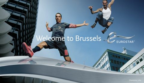
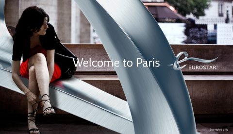
A couple of years ago the agency I was working for was approached by Eurostar – the train link between London, Paris and Brussels – for a rebrand. The train company wanted to milestone the merge of three companies and countries plus showing the high standard of travel they are hosting.
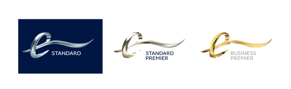
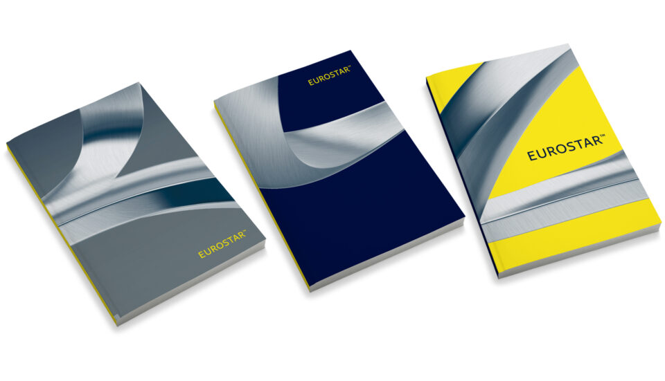
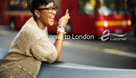
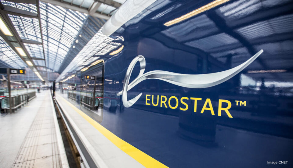
To communicate Eurostar’s ethos ‘always moving forward’ a multifaceted sculpture (both real and digital) were designed to be the main logo. The logo could easily be re-rendered with different textures to suite each department of the business. We also expanded the concept into a bespoke typeface, iconography and advertising – rolling out a 360° brand identity.
Similar to the story of the London 2012 logo, the new identity receive mixed feelings to start with. But as slow growing love anchors stronger foundations, travellers of London, Paris and Brussels are now very proud of their Eurostar identity and it has become a symbol of high quality travelling.